Case studyEditorial designSOIESNEPAL — Thapathali Campus
Building the visual identity behind Innovation, Industry, Prosperity.
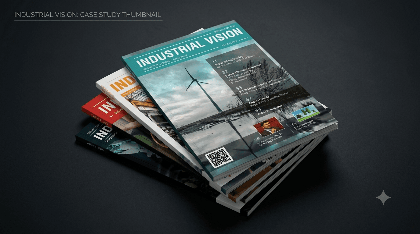
Design Lead and Art Director for Industrial Vision — SOIESNEPAL's print magazine for Thapathali Campus's Industrial Engineering community. Real research, real industry advertising, and a visual identity I've shaped since IV 2.
Challenge
Industrial Vision runs on real industry advertising and carries original research and articles — it needed a visual identity substantial enough to match both, not something that read as a student handout.
My role
Design Lead & Art Director since 2016 — shaping cover concepts, the layout system, and print production across nine editions, IV 2 through IV 10.
Outcome
A consistent, credible visual identity across nearly a decade, IV 2 through IV 10, extended from print into a downloadable PDF, with IV 11 now underway.
Context
A real magazine, not a class handout.
Industrial Vision is SOIESNEPAL's print magazine for the Industrial Engineering community at Thapathali Campus — read by students, faculty, alumni, and industry partners, and funded in part by advertising from industrial businesses. Every edition carries original research and articles from the department, under one tagline: Innovation, Industry, Prosperity.
That combination — real research, paying advertisers, a readership that includes industry professionals — meant the design had to earn its place next to the content. I've been the Design Lead and Art Director shaping that visual identity since IV 2, in 2016.
The core problem
Dense engineering research doesn't read itself.
Every edition mixes long-form research papers, technical articles, and interviews with industry professionals — content that's substantive but not naturally inviting. The design had to make that content genuinely readable for a student audience while still looking credible enough to sit next to paid industry advertising. Neither side of that could win at the other's expense.
Design moves
Three decisions behind the identity.
A layout system built for dense content.
A grid and type hierarchy in InDesign that makes long-form research and interviews as readable as they are credible — not just another article dump.
A cover identity strong enough to carry the tagline.
One consistent wordmark and cover language across editions, re-themed each year — instantly recognizable as Industrial Vision, never a repeat.
Print + Digital, so each edition outlives its print run.
Pairing a downloadable PDF with each print run keeps the research and features reachable for alumni and industry readers long after physical copies run out.
Editions, one identity
IV 2 to IV 10 — same DNA, evolving execution.

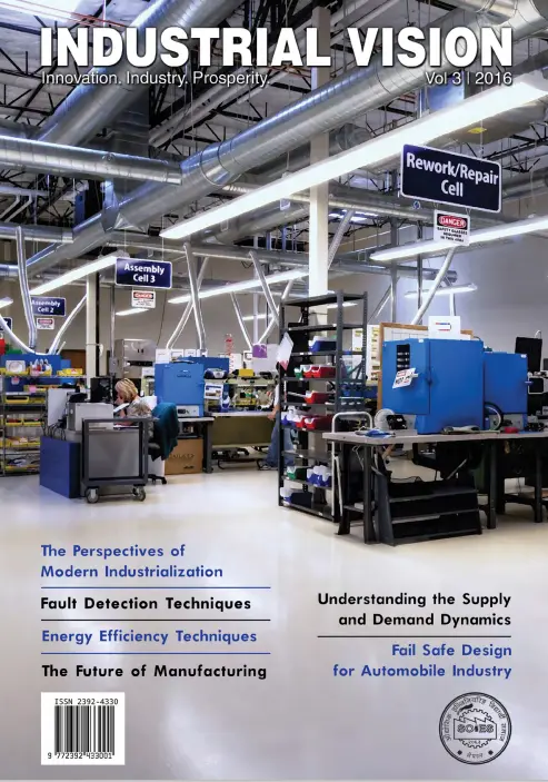
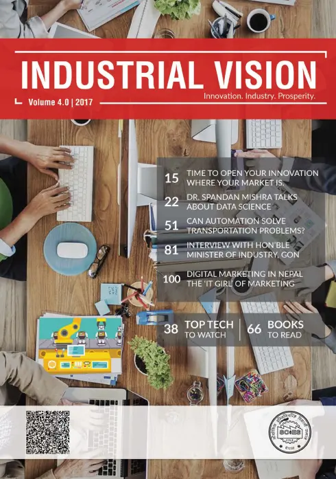
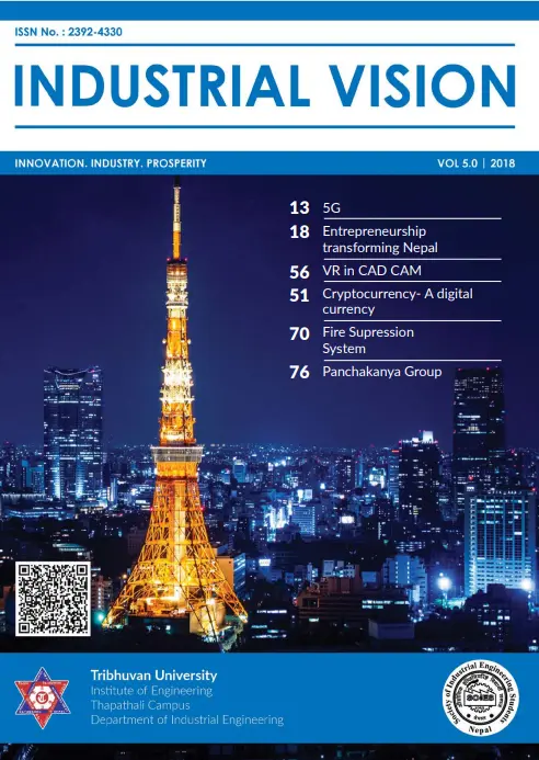
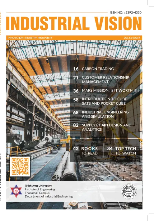
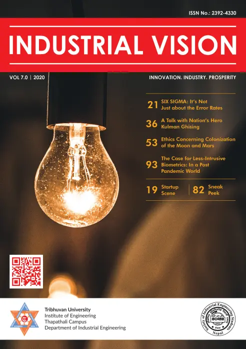
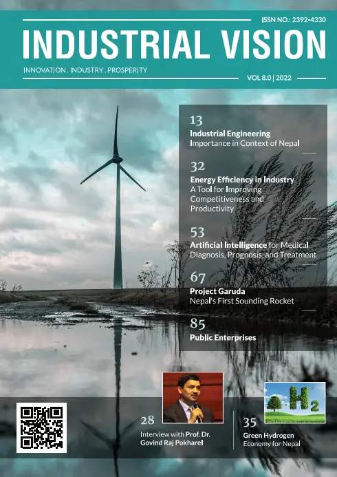
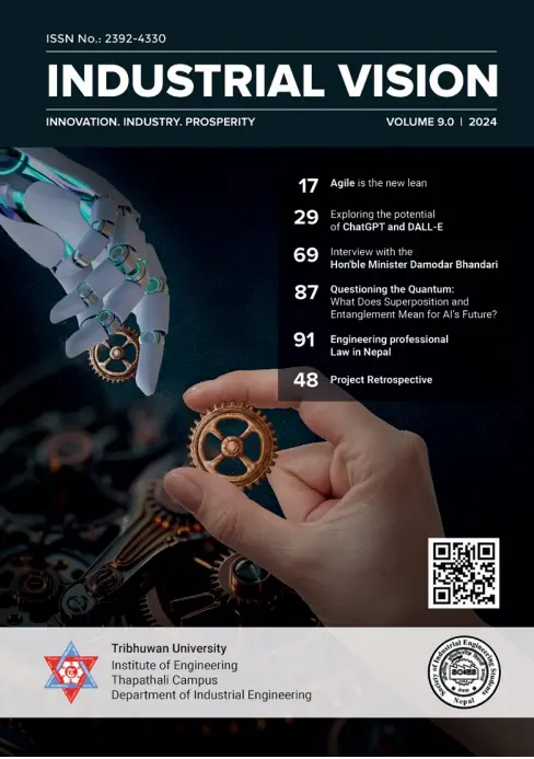
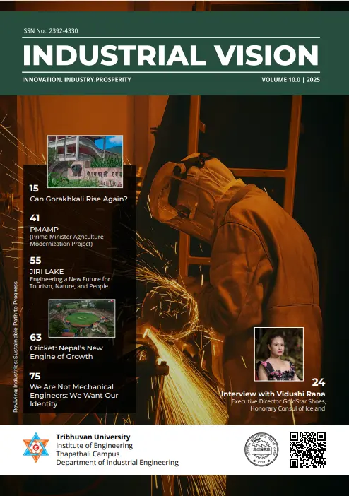
Each edition carries its own research theme — from lean manufacturing to sustainable energy, artificial intelligence, and industry in Nepal — inside one consistent visual identity.
A closer look
Inside IV 10 — Industry in Nepal.
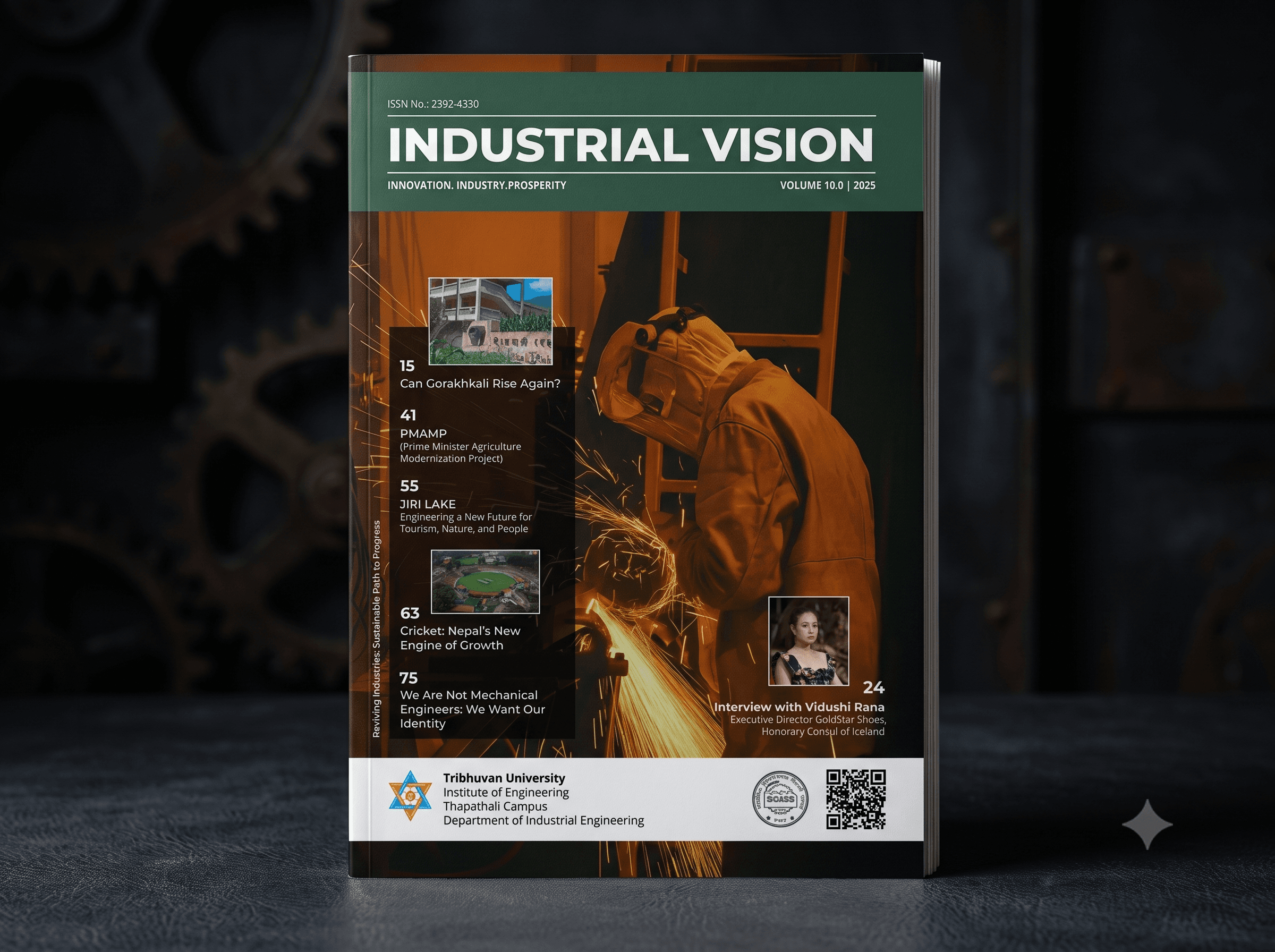
A cover built around one theme.
Same wordmark and grid every edition shares, re-themed for that year's focus on industry in Nepal.
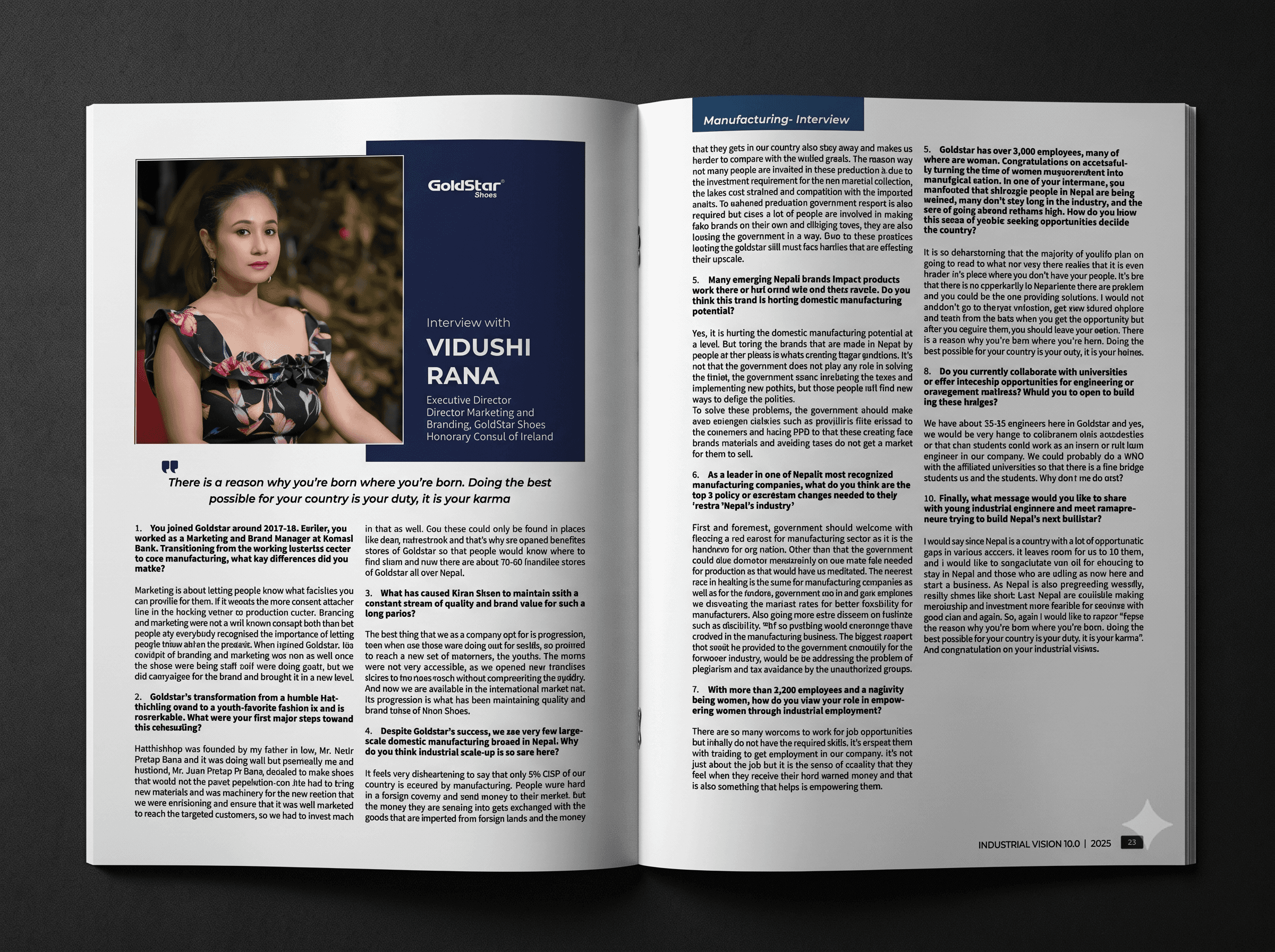
The grid, doing the actual work.
A real interior layout — the same column structure and type rules every team inherits, applied to a new feature.
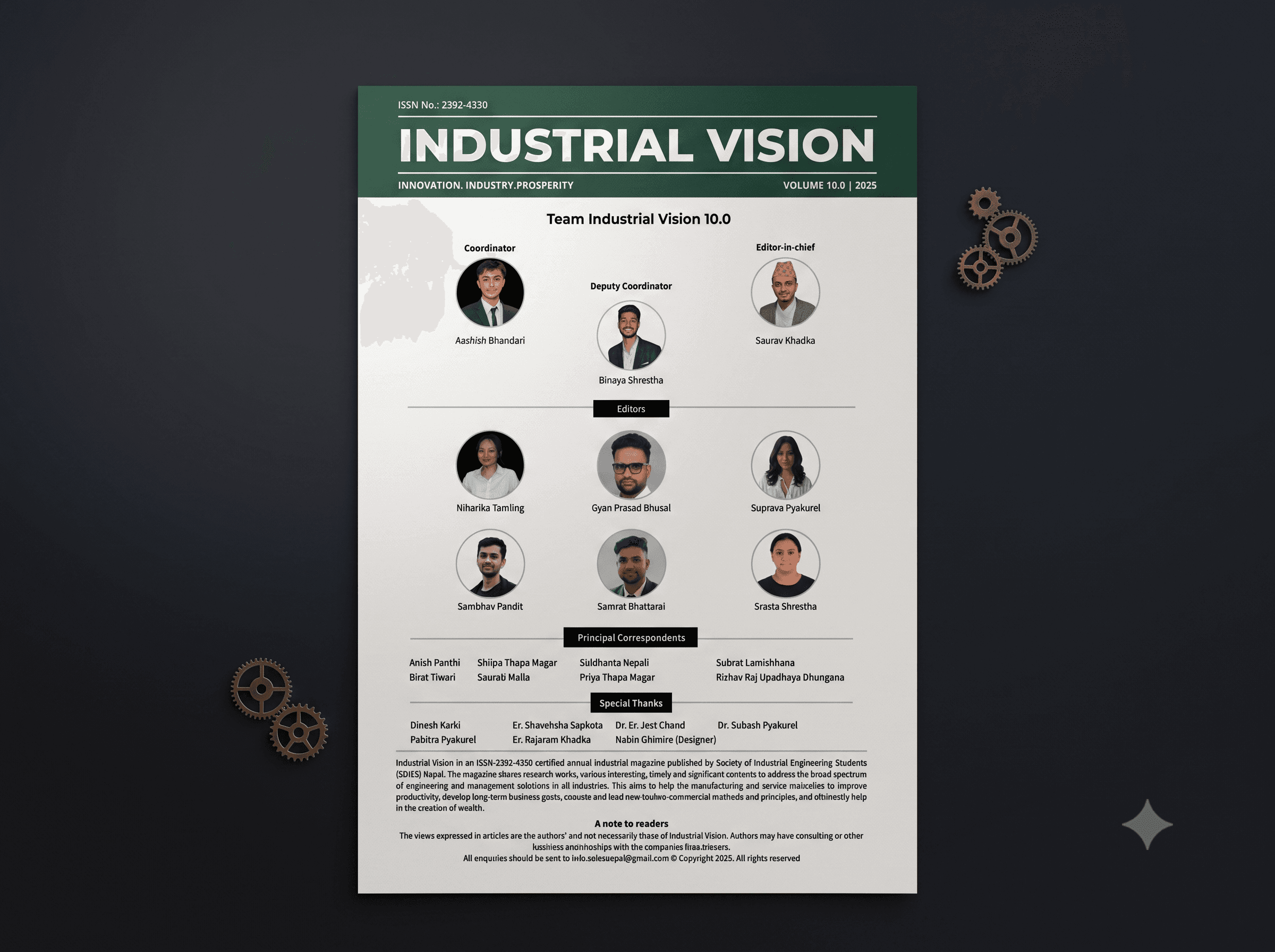
The people behind the research.
Every edition credits its writers, researchers, and industry contributors — a real editorial team, not a one-person show.
Outcome
What nine editions actually proved.
One identity, nearly a decade strong.
Nine editions, IV 2 through IV 10, carrying one consistent, recognizable visual identity since 2016.
Backed by real industry advertising.
Funded in part by ads from industrial businesses each cycle — a standing signal that the magazine's design and content meet a professional bar.
Research made genuinely readable.
A layout system built to carry long-form technical content and interviews without losing the reader — credible and approachable at once.
Print, extended into digital.
Each edition now ships with a downloadable PDF alongside the print run, extending its reach well past a limited print copy count.
Reflection
The first design system I ever built — I just didn't call it one yet.
Keeping one visual identity credible across nearly a decade, through new themes and new content every year, was my earliest lesson in systems thinking — build the rules once, then let them carry very different content without losing what makes it recognizable. It's the same instinct behind the design system work I do professionally today, years before I had a name for it.